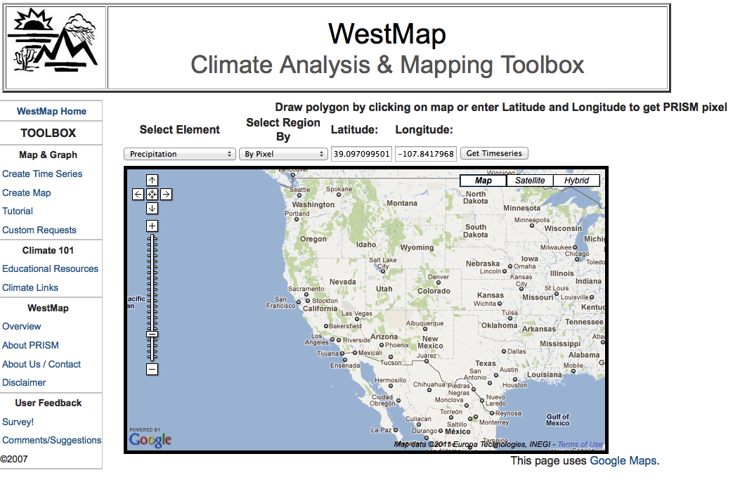
| Quick Map "Snapshot of Climate" |
Mapping Toolbox | Time Series Toolbox | ||
| 1. Long-term average - hydrologic units | 1. Region or Subregion of interest - season precipitation - color w/o contours | 1.Subregion - county - minimum temperature-period of record - running mean - long term mean included | ||
| 2. Departure from 30 year normal - county | 2. Composite - precipitation totals for selected years – color w/ labeled contours | 2. Hydrologic Units - water year precipitation | ||
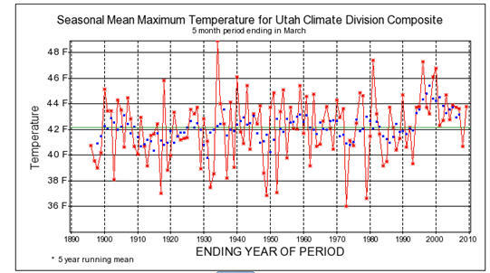
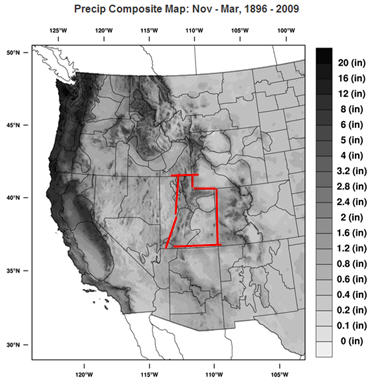
| 3. Range of temperatures - climate divisions | 3. Difference Map- temperature extremes – black & white w/o contours | 3.Climate Divisions - composite- winter precipitation & maximum temperatures | ||
| 4. Departure from long-term mean – User Specified aggregate region & Mapping Tool Box extension | 4. Anomaly – season departure from long term average– black & white w/o contours | 4. Subregion of interest – summer mean temperature & winter precipitation - external data analysis | ||
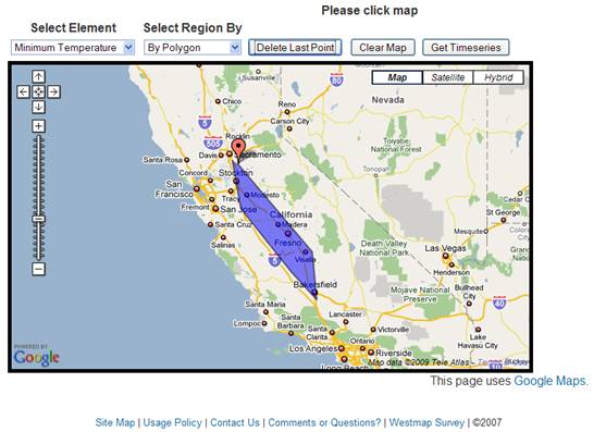
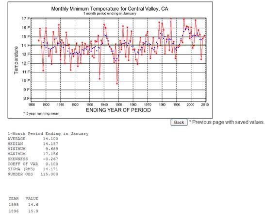
| 5. Temperature Time Series – User Specified polygon/ pixel & Time Series Tool Box extension | 5. Anomaly - month departure from user specified, non-standard mean – color no contours | 5. Point data - winter precipitation - individual pixel |
 |
| QuickMap is
available on the main page of the WestMap
Climate Analysis
& Mapping Toolbox. The imagery displayed below is an
example
of a product created using the QuickMap functions. The
QuickMap
domain reflects the full western United States regional coverage
available through the WestMap toolbox. At present all maps
created using QuickMap will be related to the most current month of
PRISM data available. Climate elements available for viewing
include precipitation, max/min/mean temperature for the most recent
available month of PRISM data. Future options will allow user to specify month. QuickMap options provide multiple paths to the interactive time series plotting tool for creation of time series plots based on QuickMap specification or additional custom specifications. An option under Select Record will take user to an interactive map creation tool that will allow user to create more complex custom maps. In addition, you can create time series and additional maps using QuickMap redirect options or the interactive Mapping Toolbox accessible by clicking on “Create Maps” on the left hand menu. |
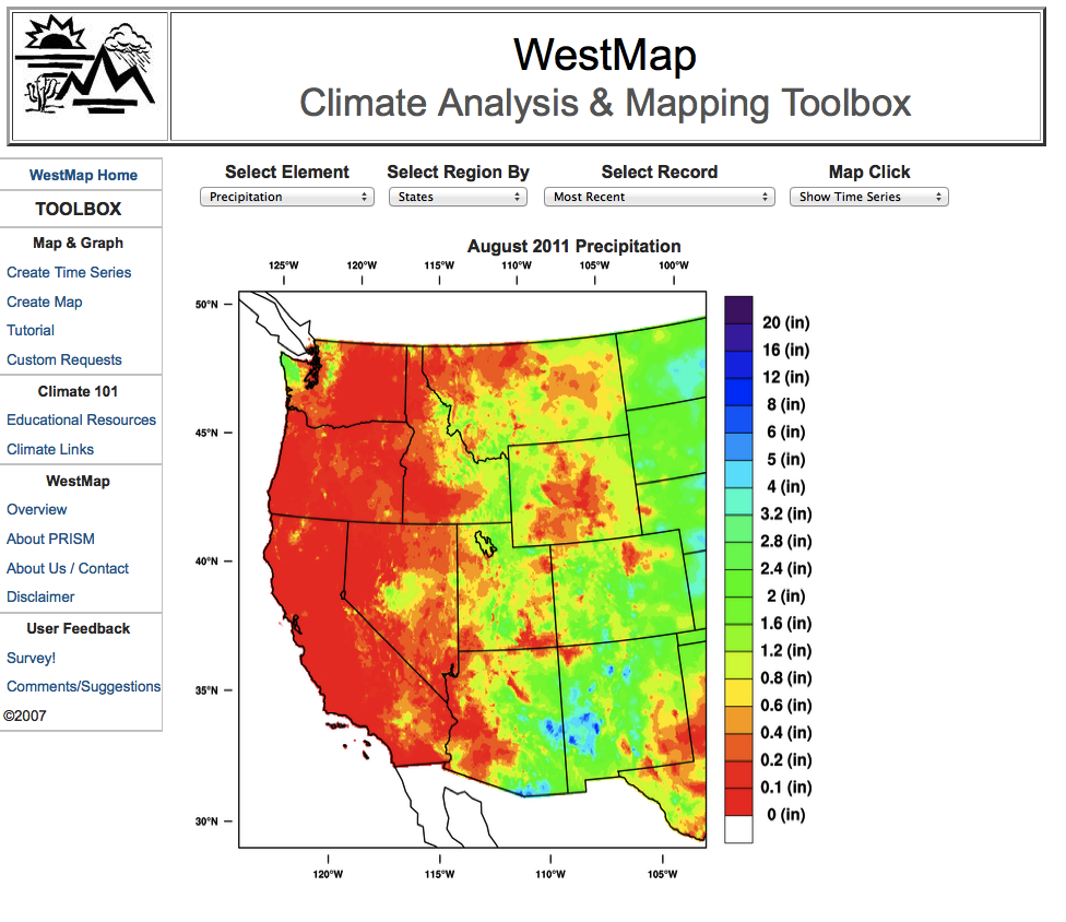
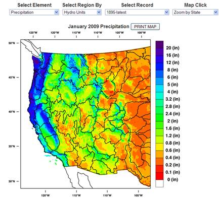
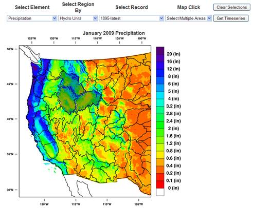
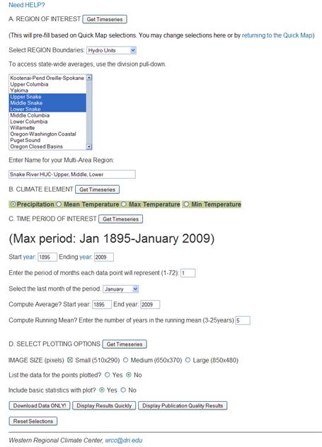
| QuickMap Example 1: What does the long term average January precipitation look like for Hydro Units across the western United States?. |
Using the QuickMap pull down menus, you can create the map shown here.
 |
|
Climate Summary: Based on this map, it is evident that the coastal hydro units are much wetter than the units in the middle of the country. It is also apparent that there are pockets of higher precipitation throughout the west, corresponding to higher elevations. Finally, the abrupt change from wet to dry going eastward from the Pacific coast is a example of the rainshadow effect. Regions on the lee side of mountains are generally drier than those on the windward side. In the case of the central valley of California, the coastal ranges create a rain shadow for the valley region but the Sierra Nevada range, higher and more extensive, creates an even stronger shadow affecting western Nevada and regions further east. Once past the Rocky Mountains, the Pacific moisture is less influential...as the interior has a continental climate ...between Pacific and Gulf of Mexico. |
| QuickMap Example 3: What is the range of January maximum temperatures for interior Washington climate divisions over the period 1971-2000 (the most recent “standard” 30 year climatic ”norm”)? In other words, which division has the coldest temperatures? Warmest? And what is the difference between these extremes? |
Using pulldown menu options in QuickMap, you could create a map similar
to this one. Then you could click on climate divisions of
interest to obtain time series like the ones shown
here.
Based on this information, you could answer the questions.
 |
| Climate Summary: The map indicates that the warmest interior climate divisions over the 30 year period are those along the Columbia River system in the southeastern corner of the state. The coolest interior climate divisions are in central and northern Washington, higher elevation regions (the Palouse) influenced by the coastal mountain rainshadow to the west and cold Canadian air from the north. There is at least a 10 degree difference in temperature between climate divisions along the central/eastern Oregon border (Columbia River) and the regions to the north. The warmer regions are more likely to have rain than snow, or have a shorter period of snow cover than the cooler regions. The cooler interior regions may have a longer lasting snow pack by virtue of being colder, but precipitation totals are likely to be lower because the western mountains block much of the moisture from coming into this region. The interior Washington grasslands is well known for wildfires. |
|
This interactive tool is accessible from the left hand menu or from the "create map" option in QuickMap. |
|
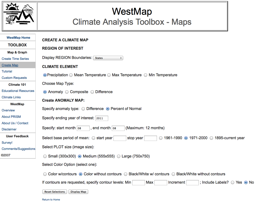
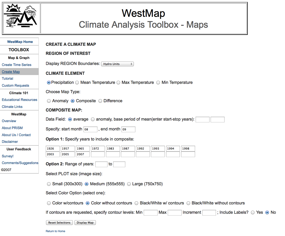
Mapping Options include: 1. Regional Boundaries: States, Counties, Hydrologic Units, Climate Divisions 2. Climate Elements: Precipitation, Mean Temperature, Maximum Temperature, Minimum Temperature 3. Type of Map: Anomaly, Composite, Difference, and combinations of these 4. Time Period of Interest: Maximum period of record is January 1895-present, monthly data 5. Visualization: map size, contour/shade, labels, color/B&W 6. Final Product: Map image displayed in a separate window for download or screen capture |
_____________________________________________________________________________________________________________________________
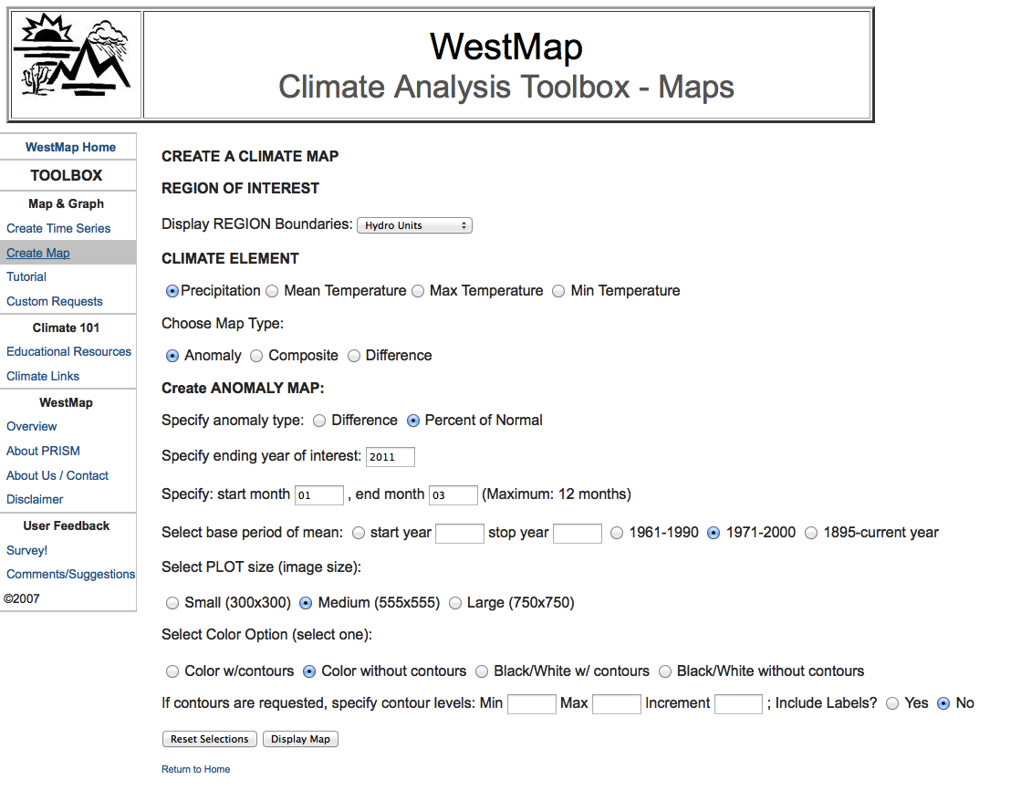
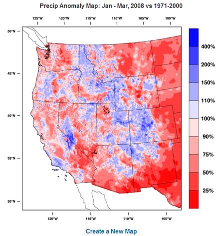
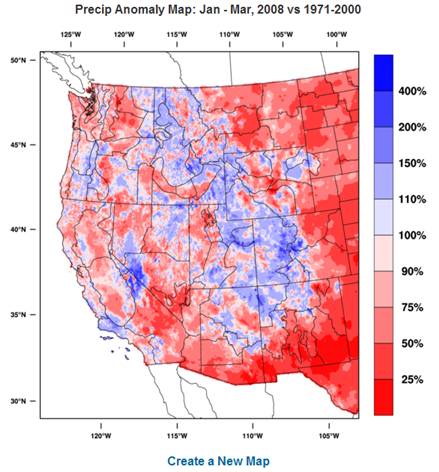
| Mapping Example 1: Create a map of 2008 Winter precipitation (J,F,M) anomalies for HYDRO UNITS across the western United States. Identify Units that received unusually high or unusually low precipitation in Winter 2008. Try this example with each of the provided regional boundary outlines. | |
|
Steps 1. To begin from the "home" page of the WestMap site, click on "create map" in the left menu. 2. Select REGION Boundaries (hydro units, states, counties, climate
divisions): Hydro Units |
|
 |
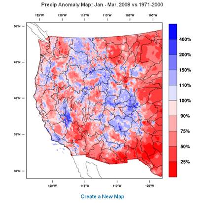 |
| Climate Summary: Examining the map allows you to determine that the Rocky Mountains, southern Sierra Nevada, Oregon coast range, San Gabriel Mountains, and the high country in Arizona received above normal precipitation for the January -March 2008 period, ranging from 110 to 200% of normal, with the Sierra Nevada and isolated areas in the Rockies receiving upwards of 400% of normal. Areas of lower than normal precipitation included the entire west coast, the northern Sierra's, the desert southwest including the lower Colorado River basin (25-50%) and the lower & middle Columbia River basins (25-50%). Driest areas were along the US-Mexico border (0-50%), Death Valley(0-75%), central Oregon, and most of Washington. In general, mountainous regions and higher elevations received above normal precipitation during this winter period, January -March 2008. This is a postive situation for water resource management, especially if the precipitation fell primarily as snow. | |
If you are interested in other spatial boundaries, return to the interactive options and select a new region(s). Options are shown below. |
|
|
State Boundaries
|
County Boundaries
|
|
Climate Divisions
|
Zoom Region (Coming soon!)
|
|
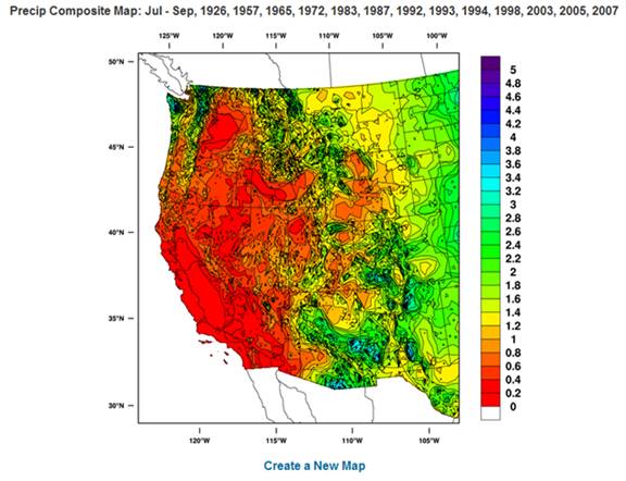
Mapping Example 2: On average, how do precipitation totals vary spatially during El Nino summers ? Create a composite map with climate division boundaries showing precipitation “totals” associated El Nino summers, 1895-present. Show color map with labeled contours. |
|
|
Fill
in the Climate Analysis Toolbox- Maps options as shown below. |
Final Map |
 |
 |
|
Climate Summary: Map indicates that with the exception of the western third of Washington, the northwest corner of Oregon, and a narrow band in central Oregon, the west coast states receive less than 1 inch of rain during El Nino summers. Higher precipitation in the desert southwest is the result of enhanced seasonal monsoon moisture, an occurrence characteristic of El Nino episodes. |
|
|
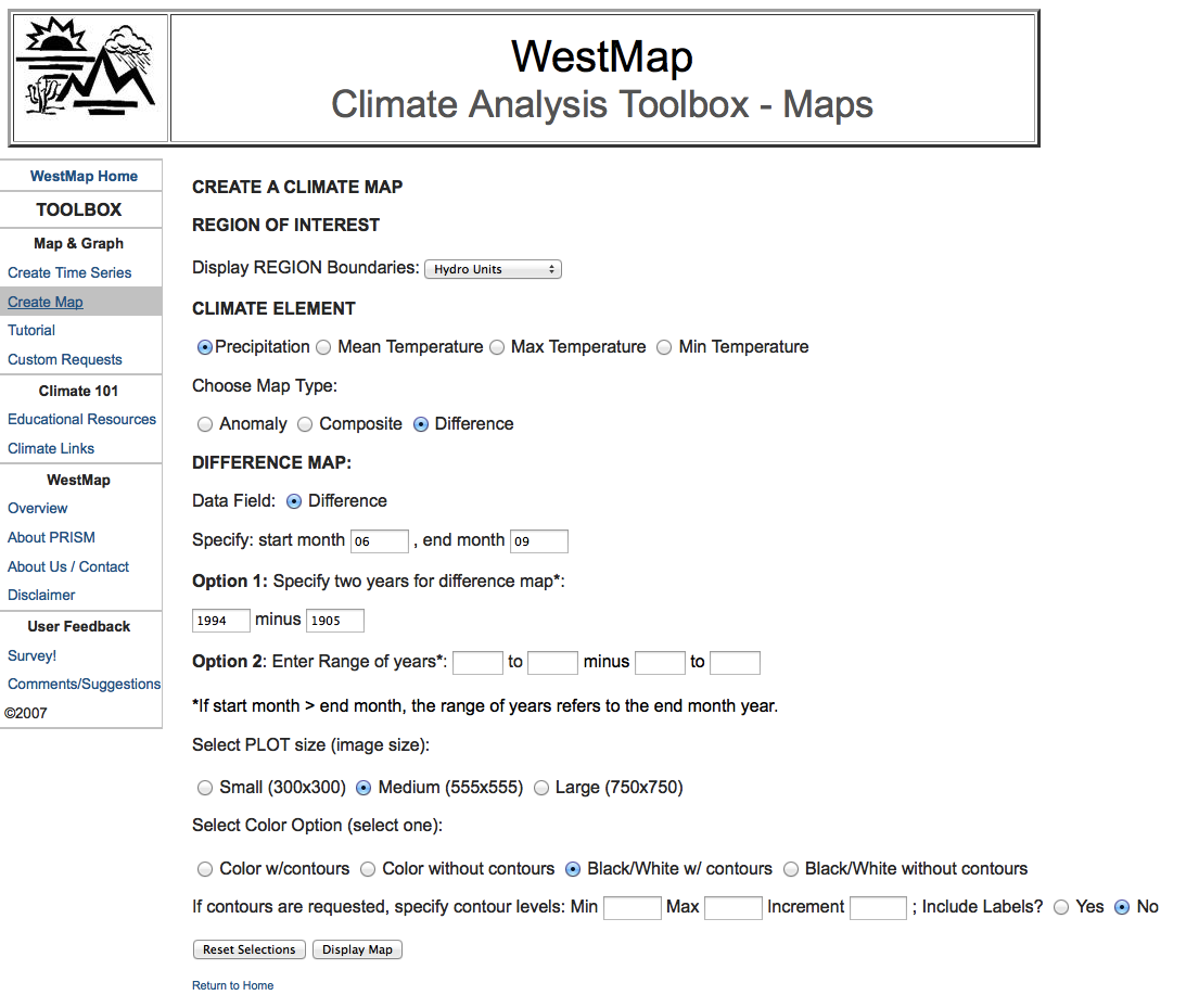
Mapping Example 3: What is the difference in maximum temperature between the warmest El Nino summers and the coolest in
recent time. Create a difference map with county boundaries
showing summer 1994 – summer 1905 maximum
temperatures.
Show black and white map without contours. |
|
| Fill in the Mapping Toolbox options as shown below. (note: the toolbox will automatically provide the appropriate interactive options so that user can enter preferences for each type of map) |
Final Map |
 |
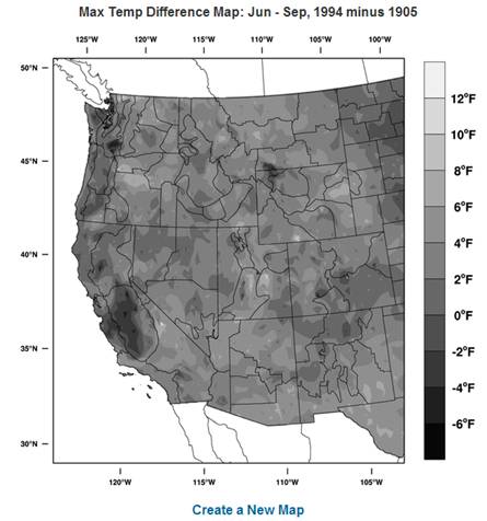 |
| Climate Summary: Mapping the difference between maximum temperatures for the warmest El Nino summer (1994) and the coolest (1905) results in the pattern shown above. Differences range from -4 to -8 in the central valley of California and a few points in southern Washington to +10 degrees in central Oregon. In general, temperatures are 4 to 10 degrees warmer across the interior west during the warm El Nino summer while coastal temperatures tend to be cooler as you go north. This suggests that El Nino summers may have an enhanced tmaximum temperature gradient between coast and interior. | |
|
Mapping Example 4:
How does the 2007 Pre-Summer (May, June) minimum temperatures
compare to the 20th Century average. Which states are warmer than
the average? Cooler? Show black and white map with contours. |
|
| Fill in the Climate Analysis Toolbox-Maps as follows: | Final Map |
 |
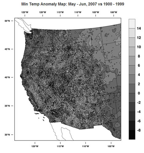 |
| Climate Summary: The map indicates that the Pacific coast and most of Washington & Oregon are cooler in May-June 2007 than the 20th Century average as are most of the mountain regions across the west. Lower elevations such as southwestern Arizona and the Central Valley region of California appear to be warmer than average. May-June is typically charaterized by coastal fog extending inland, and very warm temperatures in the interior southwest. 2007 may have been more foggy or stormy along the California, Oregon, Washington coast than normal. To learn more, you might want to plot a precipitation, or maximum temperature anomaly map for the same time period. | |
|
Mapping Example 5: How do recent December average temperatures differ
from
those of the previous decade. Create an anomaly map with
hydro
unit boundaries showing average December temperatures 2000-2008 using
mean specified as 1990-1999 average. |
|
| Fill in the Climate Analysis Toolbox-Maps as follows: | Final Map |
 |
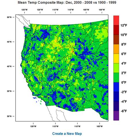 |
| Climate Summary: In general, as indicated by the widespread green and yellow shading in the map above, December 2000-2008 has been warmer than the previous decade. Southern Arizona mountains, the Lower Colorado River Basin (Arizona/California border region), and Columbia River basin (eastern Washington/western Idaho) are the most extensive below normal sectors. The Rockies and central Sierra Nevada mountain basins have scattered pockets of below normal temperature, most likely at higher elevations. Cooler temperatures at high elevation are important for maintaining and growing the snowpack vital to streamflow and downstream water resource needs. | |
___________________________________________________________________________________________________
|
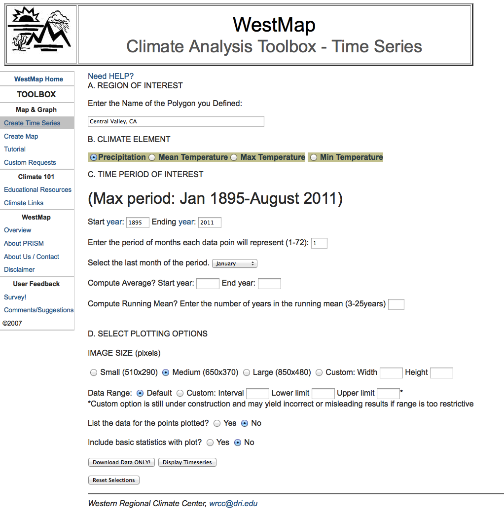
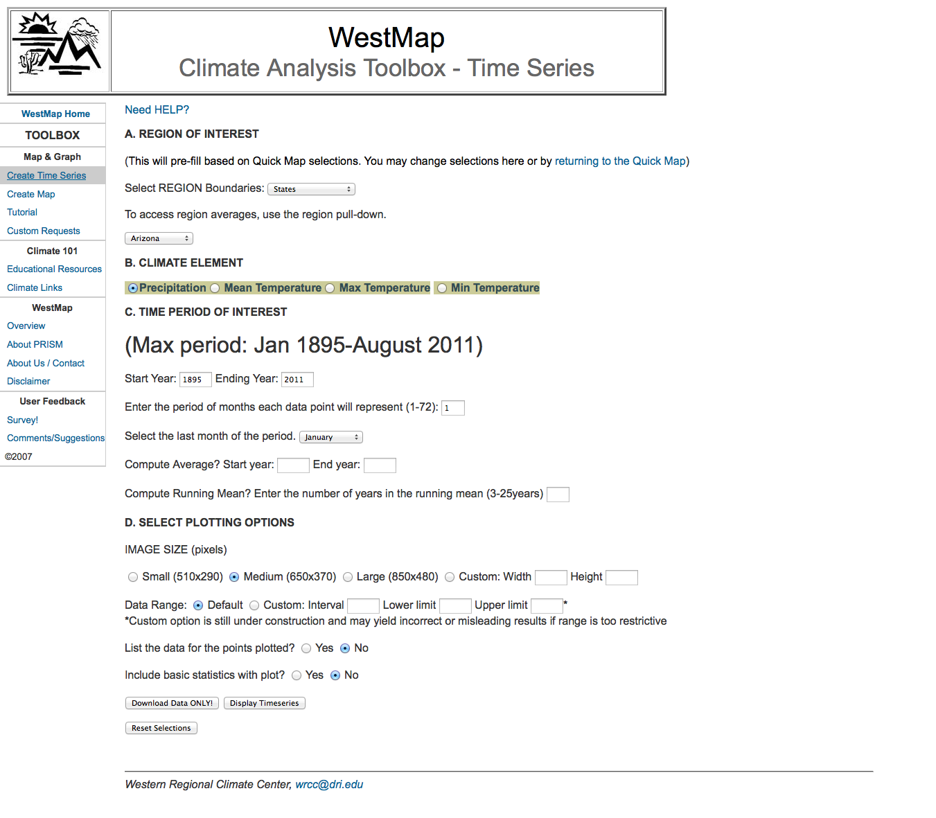
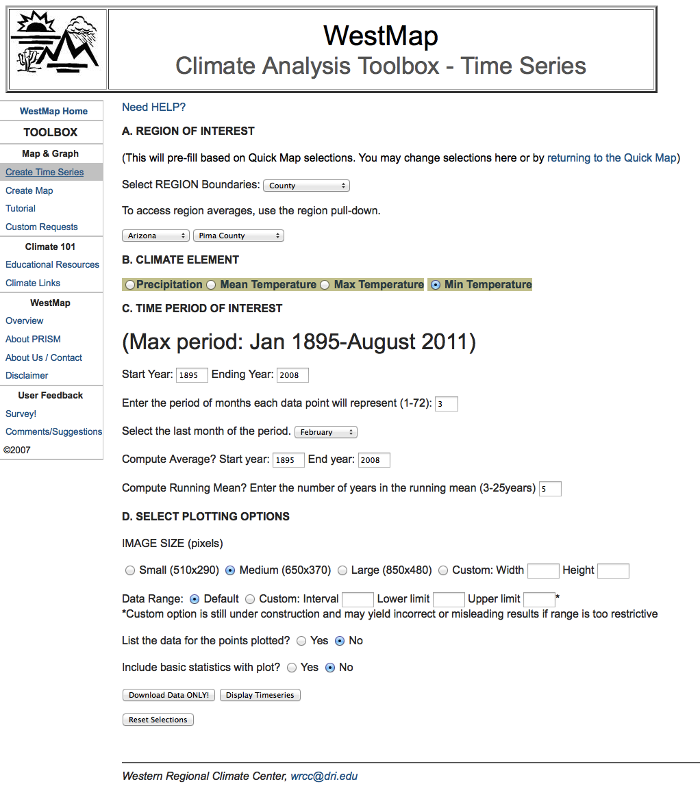
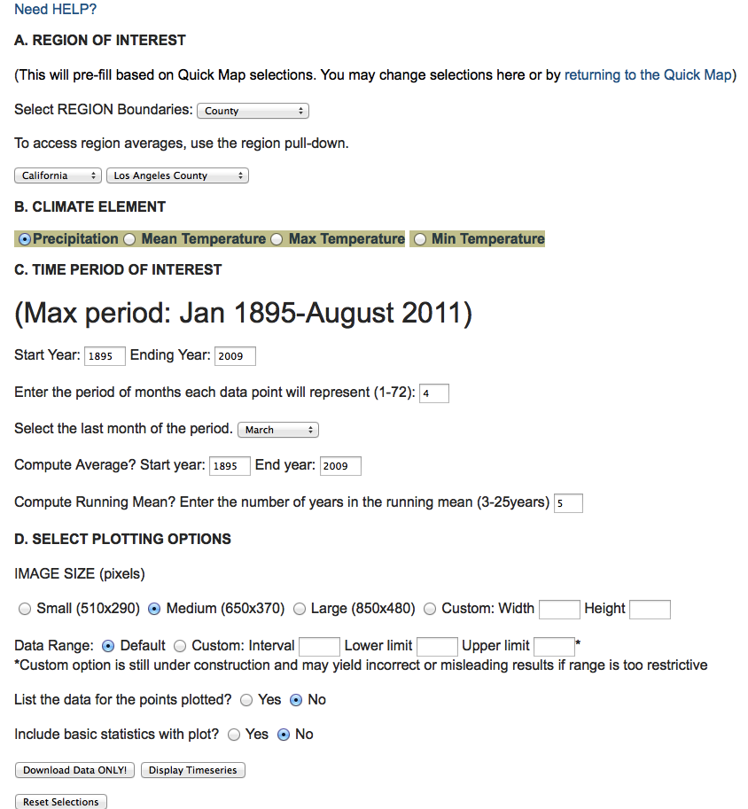
This toolbox allows a user to create time series plots based on
QuickMap options (pre-filled) or other characteristics specified using
the interactive toolbox options. The toolbox is accessible through
QuickMap options and by clicking on “Create Time
Series”
found in the left menu adjacent to the QuickMap
image. See
QuickMap section of this tutorial for details regarding access through
QuickMap. Here the focus is on the toolbox itself (as if you
entered from the left menu option).
General Time Series Tool Box Options Explained |
|
| Quick Map front page | Time Series Toolbox |
|
 |
|
Time Series Example 1: How do the winter (DJF) minimum temperatures for
Pima County,
Arizona vary over the entire period of record, 1895-2008. Include
a 5
year running mean line and an 1895-2008 mean. |
||
| Fill in the Time Series toolbox as shown: |
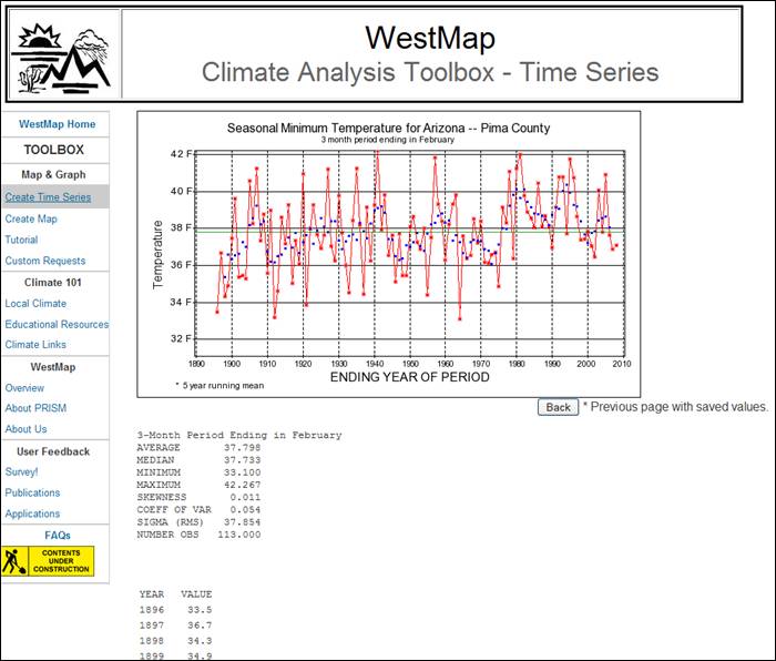
Your final plot and data series should look like this: |
|
 |
 |
|
| Climate Summary: Winter minimum temperatures (DJF) in Pima County were consistently above the 1895-2008 mean from 1980 to 1989. Following a brief drop in 1990, temperatures remained high for most of the 1990's. After a cool period around 2000, temperatures were above normal for a few years, then cooled to below normal for the most recent 3 years. The most recent 20-25 years include the longest period of above normal temperatures and two of the four warmest winter minimum temperatures in the record. Cooler than normal winters in this recent period are warmer than past cool periods in the record. Aside from possible climate variability considerations, this recent period has been one of explosive population growth and land use change conducive to development of an urban heat islan (Note: green line=mean value; blue asterisk series = 5yr running mean. | ||
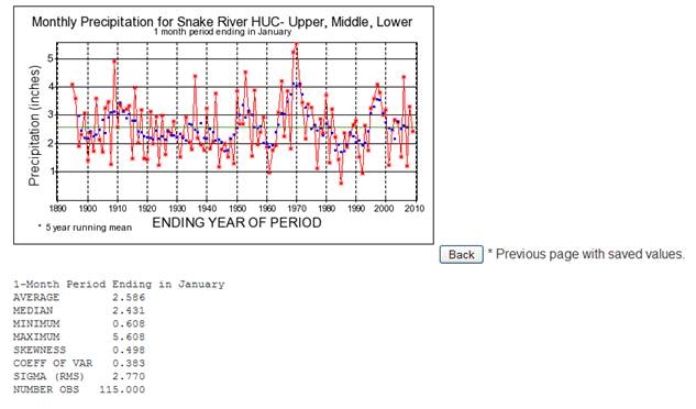
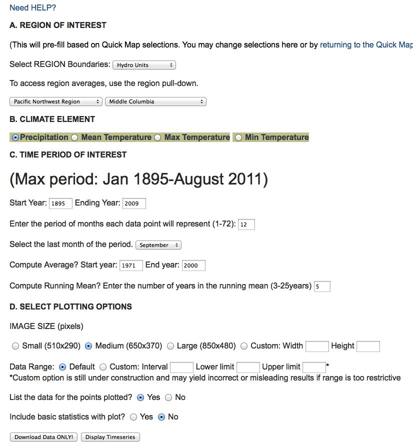
| Time Series Example 2: What is the longest period of below normal water year precipitation in
the Middle Columbia River basin (Hydro unit)? |
|
 |
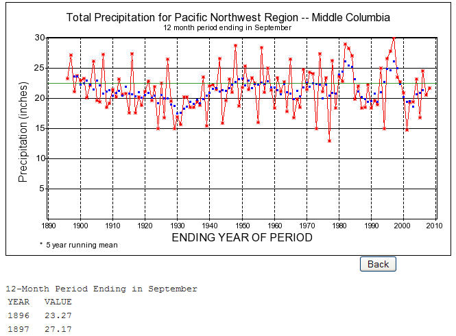 |
| Climate Summary: By
examining the plot, you can determine that there are multiple
extended periods of precipitation less than the 1971-2000 normal value
(green line). 1929-1938, 1960's (except for 1965 and 1969),
1985-1992, and 2000-2008 (except 2004 and 2006). Interestingly,
the recent wetter than normal periods correspond to years with winter
El Nino events. Another way to answer the question would be to
examine the data listing for extended periods of negative Precipitation
anomaly values. (Note:
the example shown will give you water year 1896- water year 2009,
September years; water year is defined as October -September. Example:
entering start date:1895, end date:1896 will result in October
1895-September 1896 which is water year 1896). |
|
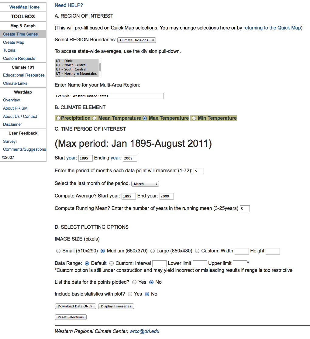
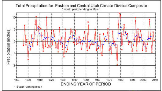
| Time Series Example 3:
Are warm winters in eastern and central Utah typically wetter or drier than normal? |
|
 |
  |
 |
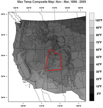 |
| Climate Summary: By visually inspecting the time series plots created, you could reasonably conclude that warm winters are typically drier than normal in this aggregate region over the period of record. For instance, 1979 was the wettest winter over the record period and had the second coolest maximum temperature. 1977 was a reverse with a maximum temperature well above average and the driest winter in this record. To obtain a more quantitative answer, you can download the composite data series for further analysis. Maps created using the WestMap mapping tool indicate the long term average precipitation and maximum temperature averages for the climate divisions included in the user-created aggregate region. | |
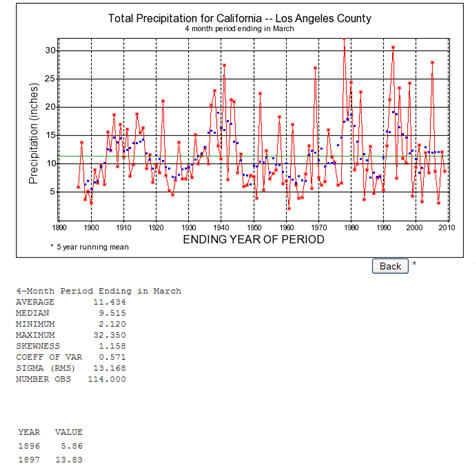
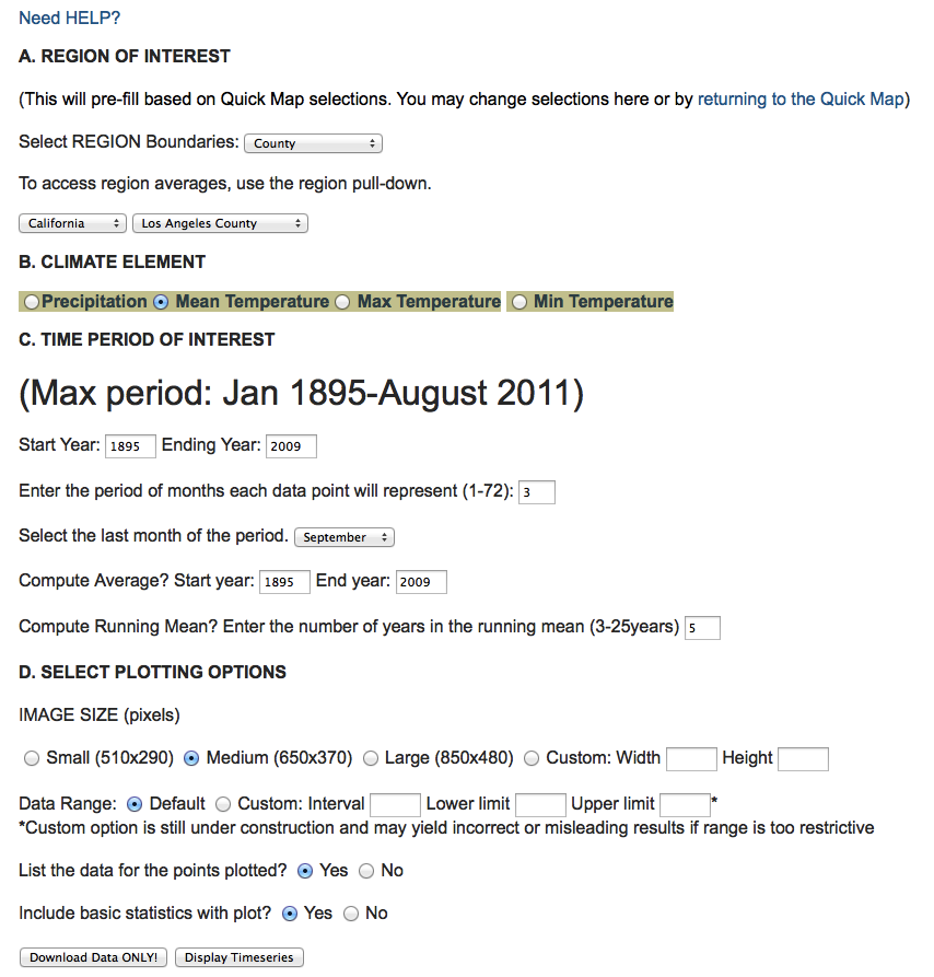
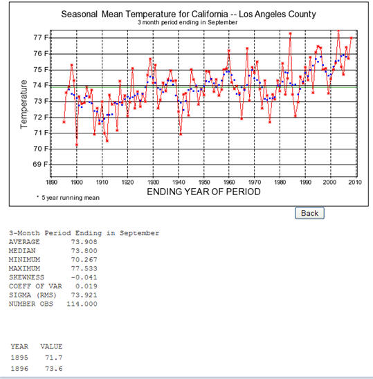
| Time Series Example 4:
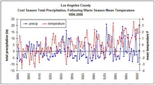
How often are above normal warm season (July-September) mean
temperatures preceded by below normal cool season (December-March)
precipitation totals in Los Angeles County? Has the frequency changed
over time? la1, la2, la3 |
|
 |
 |
 |
 |
Data
table of cool season precipitation totals, precipitation anomalies,
warm season mean temperatures, and temperature anomalies created in
MSExcel using precipitation and temperature data and statistics
generated in WestMap (see above tools & time series plots).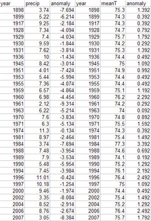 |
 Time series plot created in MSExcel using data generated in WestMap (see above tools and time series figures) and MSExcel (see data table at left). |
| Climate Summary: According to the time series plots and data tables, there have been 32 years in which below normal cool season (December-March) precipitation totals have preceded above normal warm season (July-September) mean temperatures. These years also fall within known periods of drought across the west. Frequency of occurrence has changed with the conditions occuring more commonly with greater persistence in the last 20years of the record period. To learn more about these events, you might like to plot each month of the season separately to determine which month had the greatest influence on precipitation totals and/or mean temperature. Timing of anomolous conditions is of importance for water resources and also fire management planning. | |
| Time Series Example 5: How persistent are years of below normal winter precipitation at Mammoth Mountain ski area? | ||
|
----------------------------------------
|
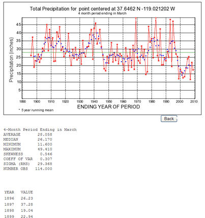 |
| Climate Summary: To answer this question of persistence, you may either inspect the plot visually or copy the data listing into your favorite statistics spreadsheet for additional analysis. The plot (1895-2009 winter) shows that there have been 8 occurrences of below normal (1895-2009 mean) precipitation lasting for two water years, two occurrences of below normal precipitation lasting three years, and one occurrence each lasting four, five, and six years. This would indicate that below normal winter precipitation typically persists two-three years. However, winter precipitation has been below normal from 1997 to at least 2008, making that the longest period of uninterrupted below normal winter precipitation in the record. This has serious implications for the region as less winter precipitation typically indicates less snowpack for water resources and recreational use. The plotted data provide evidence that Mammoth Mountain ski area winter precipitation record has been strongly affected by the ongoing widespread extended drought affecting the California mountains and Western U.S, in general. Note: winter is defined here as DJFM, or December, January, February, March. Winter date given as March year. | ||